A lightweight, presentational React library that renders beautiful, GitHub-styled preview cards for Pull Requests and Repositories. Supports 4 layout variants, light/dark themes, labels, CI checks, i18n relative dates, skeleton loaders, and deep typography customization --- all with zero external dependencies.
These components do NOT fetch data from the GitHub API. They are purely presentational ("dumb") components. You are responsible for providing the prData or repoData prop. This design guarantees zero rate-limiting issues, zero server costs, and maximum flexibility.
npm install react-github-pr-preview- React >= 18.0.0
- ReactDOM >= 18.0.0
import { GithubPrPreview } from "react-github-pr-preview";

const myPrData = {
  title: "Fix memory leak in useEffect cleanup",
  number: 42,
  state: "open" as const,
  merged: false,
  url: "https://github.com/octocat/Hello-World/pull/42",
  author: {
    login: "octocat",
    avatarUrl: "https://github.com/octocat.png",
  },
  createdAt: "2024-01-15T10:30:00Z",
  additions: 24,
  deletions: 8,
};

export default function App() {
  return <GithubPrPreview prData={myPrData} />;
}import { GithubRepoPreview } from "react-github-pr-preview";
const myRepoData = {
name: "react",
description: "A declarative, efficient, and flexible JavaScript library for building user interfaces.",
url: "https://github.com/facebook/react",
owner: {
login: "facebook",
avatarUrl: "https://avatars.githubusercontent.com/u/69631?v=4",
},
stargazersCount: 231800,
forksCount: 47400,
language: { name: "TypeScript", color: "#3178c6" },
topics: ["react", "frontend", "ui", "javascript"],
license: "MIT",
pushedAt: "2026-04-24T09:15:00Z",
};
export default function App() {
return <GithubRepoPreview repoData={myRepoData} />;
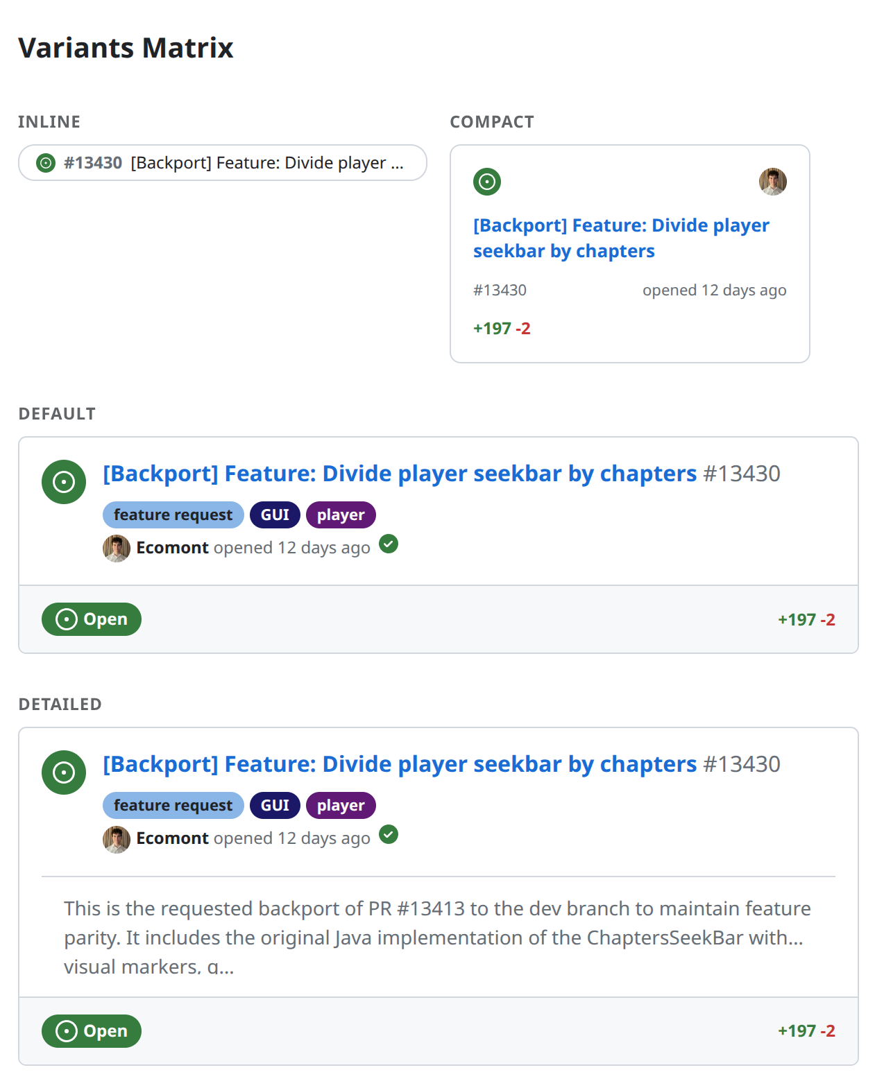
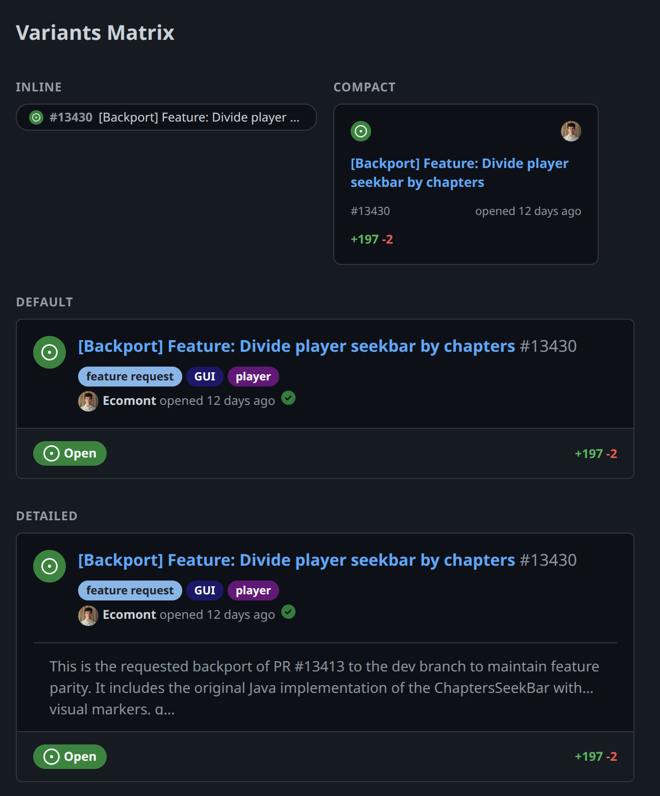
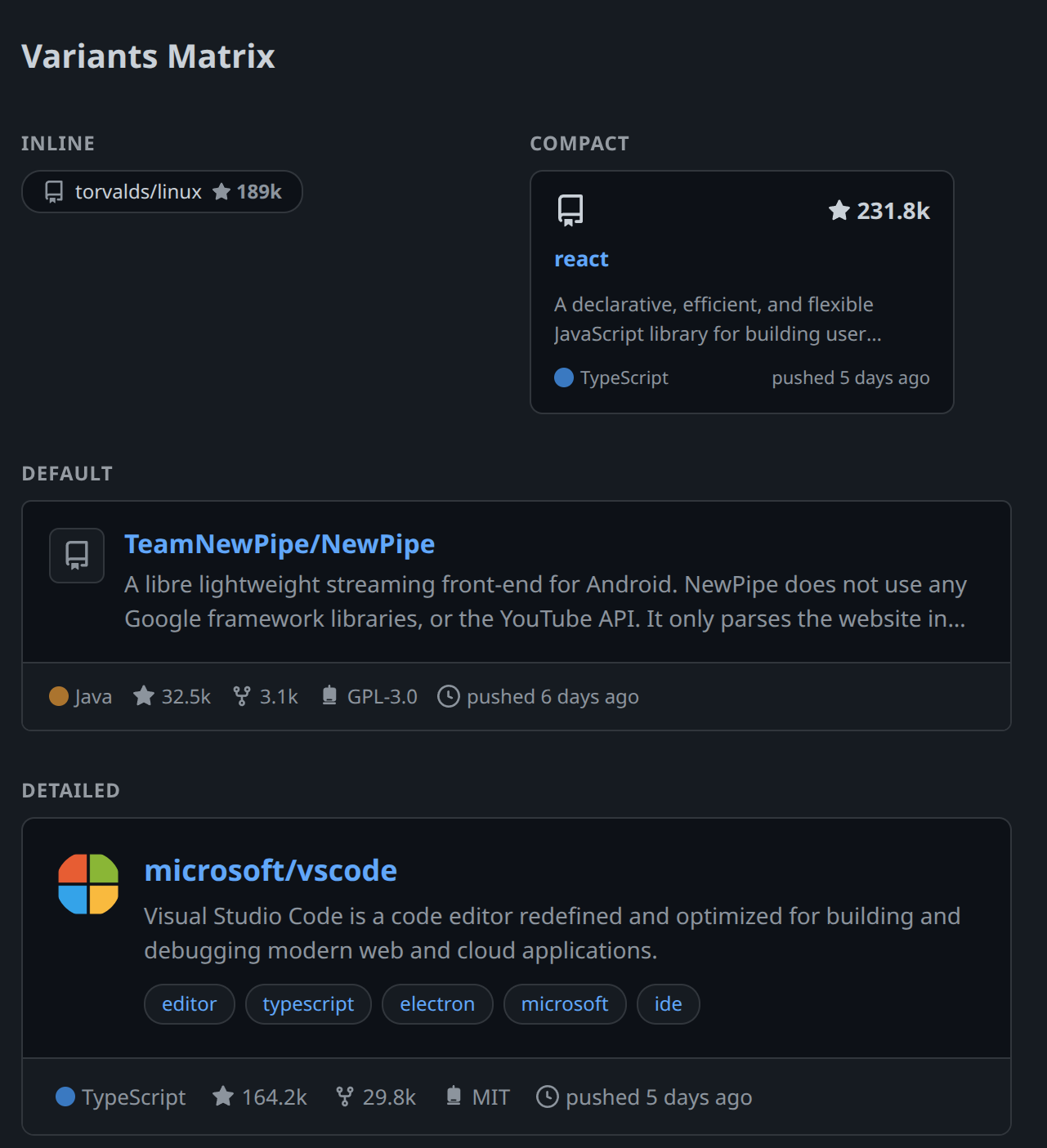
}Four layout variants for every use case --- from dense inline chips to rich detail cards.
All components adapt seamlessly to dark themes. Pass theme="dark" or use theme="system" to respect the OS preference.
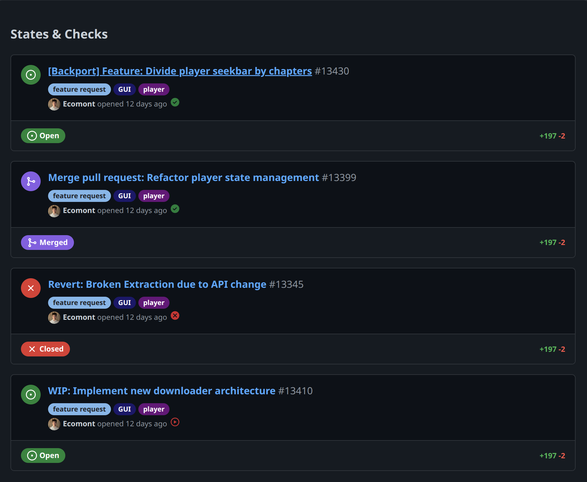
Visual distinction for open, merged, closed, and pending check states.
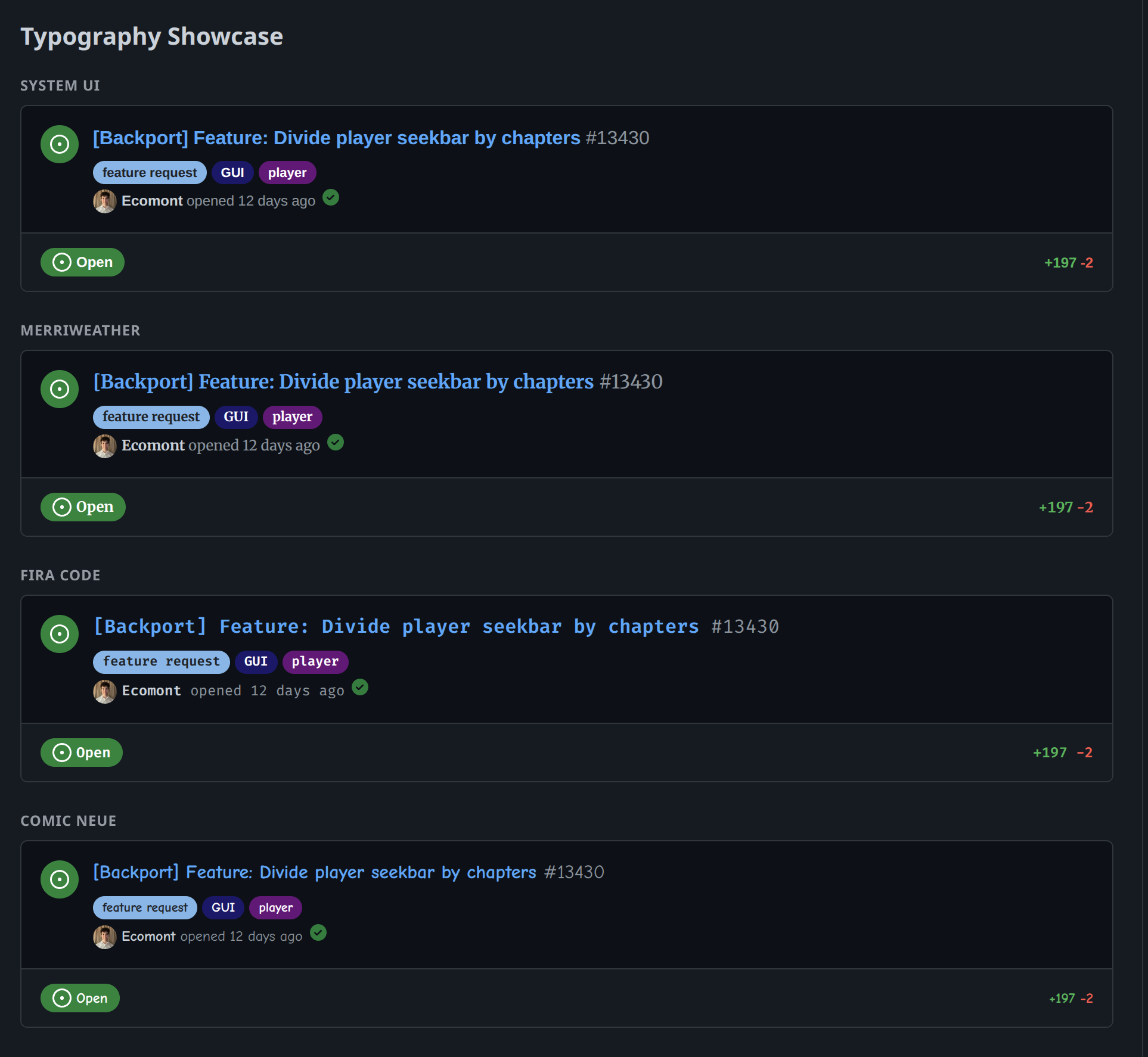
Inherits your site's font by default. Override per-instance or globally via CSS variables.
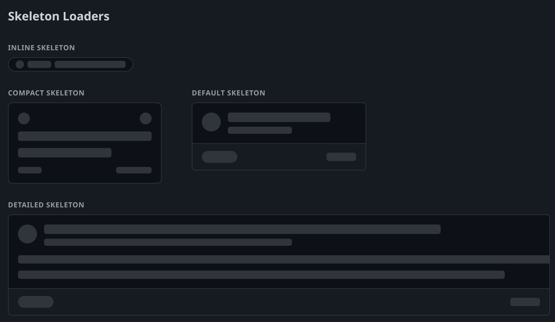
Pulsing placeholders for every variant while data loads.
The same attention to detail for repository previews --- stars, forks, language, license, and topics.
A comprehensive Vite-based showcase is included in the repository. To run it locally:
cd playground
npm install
npm run dev
The playground demonstrates all variants, themes, typography overrides, states, skeleton loaders, and localization for both Pull Requests and Repositories.
The familiar GitHub row. Status icon, full title, labels, author, relative date, checks status, and diff stats. Best for feeds and list views.
<GithubPrPreview prData={myPrData} variant="default" />A vertical card (~260px) perfect for dashboards and grid layouts. Shows the status icon, author avatar, a 3-line-clamped title, and footer metadata.
<GithubPrPreview prData={myPrData} variant="compact" />An ultra-minimal single-line pill that fits inside paragraphs or dense tables. Shows only the status icon, PR number, and a truncated title.
<p>
  See also{" "}
  <GithubPrPreview prData={myPrData} variant="inline" />
  {" "}for context.
</p>Everything from default plus the first ~180 characters of the PR description. Great for detail pages and review dashboards.
<GithubPrPreview
  prData={{ ...myPrData, description: "This PR refactors the hook to..." }}
  variant="detailed"
/>Pass labels in your prData to render colored pills:
const prData = {
  labels: [
    { name: "bug", color: "d73a4a" },
    { name: "enhancement", color: "a2eeef" },
  ],
};
Labels are automatically rendered in default and detailed variants with accessible contrast text.
Show check status with a semantic icon:
const prData = {
  checksStatus: "success", // 'success' | 'failure' | 'pending'
};Dates are formatted relative to now using the native Intl.RelativeTimeFormat API:
<GithubPrPreview prData={myPrData} locale="es-ES" />
// -> "abierto hace 2 dias"
Supported locales: any valid BCP 47 language tag (e.g., en-US, es-ES, fr-FR, de-DE).
Show a pulsing placeholder while data loads:
<GithubPrPreview.Skeleton variant="default" />
<GithubPrPreview.Skeleton variant="compact" />
<GithubPrPreview.Skeleton variant="inline" />
<GithubPrPreview.Skeleton variant="detailed" />

<GithubRepoPreview.Skeleton variant="default" />
<GithubRepoPreview.Skeleton variant="compact" />
<GithubRepoPreview.Skeleton variant="inline" />
<GithubRepoPreview.Skeleton variant="detailed" />- Status icons have descriptive
aria-labelattributes (e.g., "Pull Request: Open"). - Card variants use semantic
<article>tags. - Dates are wrapped in
<time>elements with machine-readabledateTimeattributes. - Labels maintain accessible contrast ratios.
You can pass standard className and style props to the root container for quick overrides:
<GithubPrPreview
  prData={myPrData}
  className="my-pr-card"
  style={{ maxWidth: "600px", margin: "0 auto" }}
/>
Because the component uses CSS classes internally, you can also override specific parts from your own stylesheet:
.my-pr-card .gh-pr-title a {
  color: #ff6b6b;
}Control the color scheme with the theme prop:
| Value | Behavior |
|---|---|
"light" |
Forces the light GitHub theme. |
"dark" |
Forces the dark GitHub theme. |
"system" |
Default. Automatically adapts to the user's OS preference. |
{/* Force dark mode */}
<GithubPrPreview prData={myPrData} theme="dark" />

{/* Respect OS setting (default) */}
<GithubPrPreview prData={myPrData} theme="system" />By default, the component inherits your website's font via font-family: inherit. You have three levels of control:
1. CSS Variable (global override)
.gh-pr-wrapper {
  --gh-pr-font-family: "Inter", system-ui, sans-serif;
}
2. fontFamily prop (per-instance override)
<GithubPrPreview prData={myPrData} fontFamily="'Fira Code', monospace" />3. style prop (inline override)
<GithubPrPreview prData={myPrData} style={{ fontFamily: "Georgia, serif" }} />The precedence is: style > fontFamily prop > CSS variable > inherited font.
| Prop | Type | Default | Required | Description |
|---|---|---|---|---|
prData |
PullRequestData |
--- | Yes | The pull request data object to render. |
className |
string |
--- | No | CSS class applied to the root wrapper. |
style |
React.CSSProperties |
--- | No | Inline styles merged into the root wrapper. |
theme |
"light" | "dark" | "system" |
"system" |
No | Color theme. "system" uses prefers-color-scheme. |
variant |
"default" | "compact" | "inline" | "detailed" |
"default" |
No | Layout variant. |
fontFamily |
string |
--- | No | Font family override. Falls back to inherited font. |
locale |
string |
"en-US" |
No | Locale for relative time formatting. |
| Prop | Type | Default | Required | Description |
|---|---|---|---|---|
repoData |
GitHubRepoData |
--- | Yes | The repository data object to render. |
className |
string |
--- | No | CSS class applied to the root wrapper. |
style |
React.CSSProperties |
--- | No | Inline styles merged into the root wrapper. |
theme |
"light" | "dark" | "system" |
"system" |
No | Color theme. "system" uses prefers-color-scheme. |
variant |
"default" | "compact" | "inline" | "detailed" |
"default" |
No | Layout variant. |
fontFamily |
string |
--- | No | Font family override. Falls back to inherited font. |
locale |
string |
"en-US" |
No | Locale for relative time formatting. |
| Field | Type | Required | Description |
|---|---|---|---|
title |
string |
Yes | PR title. |
number |
number |
Yes | PR number. |
state |
"open" | "closed" |
Yes | Current state of the PR. |
merged |
boolean |
Yes | Whether the PR has been merged. |
url |
string |
Yes | Link to the PR on GitHub. |
author |
{ login: string; avatarUrl: string } |
Yes | PR author info. |
createdAt |
string | Date |
Yes | Creation date (ISO string or Date). |
description |
string |
No | PR body/description (for detailed). |
labels |
{ name: string; color: string }[] |
No | Colored labels. |
checksStatus |
"success" | "failure" | "pending" |
No | CI/CD check status. |
additions |
number |
No | Lines added. |
deletions |
number |
No | Lines deleted. |
| Field | Type | Required | Description |
|---|---|---|---|
name |
string |
Yes | Repository name. |
description |
string |
Yes | Repository description. |
url |
string |
Yes | Link to the repository on GitHub. |
owner |
{ login: string; avatarUrl: string } |
Yes | Repository owner info. |
stargazersCount |
number |
Yes | Number of stars. |
forksCount |
number |
Yes | Number of forks. |
language |
{ name: string; color: string } |
No | Primary language. |
topics |
string[] |
No | Repository topics. |
license |
string |
No | SPDX license identifier. |
pushedAt |
string | Date |
Yes | Last push date (ISO string or Date). |
The component theming engine is built on CSS Custom Properties. Override them in your own stylesheet by targeting .gh-pr-wrapper or .gh-repo-wrapper:
.gh-pr-wrapper {
  --gh-pr-font-family: "Inter", sans-serif;
  --gh-pr-bg: #fafafa;
  --gh-pr-link: #e91e63;
}

.gh-repo-wrapper {
  --gh-repo-font-family: "Inter", sans-serif;
  --gh-repo-bg: #fafafa;
  --gh-repo-link: #e91e63;
}| Variable | Light default | Dark default | Description |
|---|---|---|---|
--gh-pr-font-family |
inherit |
inherit |
Typography |
--gh-pr-bg |
#ffffff |
#0d1117 |
Card background |
--gh-pr-text-primary |
#1f2328 |
#c9d1d9 |
Primary text |
--gh-pr-text-secondary |
#656d76 |
#8b949e |
Muted text |
--gh-pr-border |
#d0d7de |
#30363d |
Borders |
--gh-pr-footer-bg |
#f6f8fa |
#161b22 |
Footer background |
--gh-pr-link |
#0969da |
#58a6ff |
Title link color |
--gh-pr-open-bg |
#1a7f37 |
#238636 |
Open badge background |
--gh-pr-merged-bg |
#8250df |
#8957e5 |
Merged badge background |
--gh-pr-closed-bg |
#cf222e |
#da3633 |
Closed badge background |
--gh-pr-additions |
#1a7f37 |
#3fb950 |
Additions count color |
--gh-pr-deletions |
#cf222e |
#f85149 |
Deletions count color |
| Variable | Light default | Dark default | Description |
|---|---|---|---|
--gh-repo-font-family |
inherit |
inherit |
Typography |
--gh-repo-bg |
#ffffff |
#0d1117 |
Card background |
--gh-repo-text-primary |
#1f2328 |
#c9d1d9 |
Primary text |
--gh-repo-text-secondary |
#656d76 |
#8b949e |
Muted text |
--gh-repo-border |
#d0d7de |
#30363d |
Borders |
--gh-repo-footer-bg |
#f6f8fa |
#161b22 |
Footer background |
--gh-repo-link |
#0969da |
#58a6ff |
Title link color |
--gh-repo-star |
#e3b341 |
#e3b341 |
Star icon color |
- No global CSS pollution: Styles are injected once into a scoped
<style>tag. No external CSS files are required. - Inherits typography: The root wrapper uses
font-family: var(--gh-pr-font-family, inherit)so the component automatically matches your website's typeface. - Responsive: The default and detailed cards use flexible layouts and
word-breakto look good at any container width.
MIT